Critique my logo please

lgski

Active member
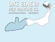
Yo NS, I just started screwing around in illustrator the other day and I decided to try and make a logo for the company I work for. This is my first attempt, and i would love any feedback you have on it, good or bad. Personally there are some things im not too fond of, like the paint bucket, but idk what to do to it.

Notes: The odd shape that the paint is pouring into is the shape of the lake

It is a pier painting company, so anything you think could get that across more, let me know.
770602.jpeg
 
13425810:eheath said:
The bottom part is very empty, either fill something in there or cut it out.

ah yes, i forgot to mention that i just took a screen shot from illustrator so in the final that will be cut out. Thanks!
 
I don't immediately associate the shape of the lake with Lake Geneva Wisconsin. My Aunt used to live there. Does your company paint docks on the lake? Maybe something with one of the mail jumpers. Or someone painting the dock next to a mail box. IDK.
 
Didn't realize it was a paint bucket at first, I guess something that would help me identify it quicker is if it had a handle. I don't know though if that's is just me! I think it's a neat idea.
 
When creating your logo you may want to consider printing on promtional materials. there are so many colors in it that it may be harder/expensive to put onto t shirts/ business cards etc. Most larger companies have logos that only contain a few colors for reasons similar to this. Not always the case, but something to think about
 
It's shit.

I'm not being mean here, just realistic.

The font is atrocious, the kerning is madness, too much text, the sweet shadow outlines and gradients are a bad idea, the shape is...strange.

The environmental message portrayed is conservative and it's all in all very 90's.

I'm not going to write a long thesis on logo design but in essence a good logo is recognisable when printed on a twenty year old laserprinter with arthritis on it's last breath of toner. Start in black and white, only black and white, absolutes before thinking about colour. Design a logo is easy, designing a good logo is ridiculously hard.
 
13426619:Laurent. said:
It's shit.

I'm not being mean here, just realistic.

The font is atrocious, the kerning is madness, too much text, the sweet shadow outlines and gradients are a bad idea, the shape is...strange.

The environmental message portrayed is conservative and it's all in all very 90's.

I'm not going to write a long thesis on logo design but in essence a good logo is recognisable when printed on a twenty year old laserprinter with arthritis on it's last breath of toner. Start in black and white, only black and white, absolutes before thinking about colour. Design a logo is easy, designing a good logo is ridiculously hard.

tell me how you really feel

jk, i am well aware its not good, i have never taken any sort of GD class or whatever, just playing around. Its just going to be plopped on flyers so color isnt such a big deal. Thanks for all the input though. oh and the shape is the lake, not some random shape i came up with
 
13426619:Laurent. said:
Design a logo is easy, designing a good logo is ridiculously hard.

Oh and yeah pretty much this. I had fun makin it, especially because i taught illustrator to myself, so not all is lost. Definitely respect gained to the people that pump out really clean recognizable and clever logos
 
Things to keep in mind:

the average consumer spends 2 seconds or less on brand recognition.

also, a logo is a graphic representation of a company identitiy & a typeface is specific lettering that complements (or replaces) a logo

also, before you go into illustrator, research what a good painting company logo looks like.

+ why is your paint white?
 
ehm, that looks nothing like lake geneva?

Karte_Genfersee.png


not sure whether it matters in your neck of the woods, but it wouldn't go down well here in ch
 
Overall for not being a graphic designer i think its great. When I first started I created the shittiest shit ever shat but on the other hand I think its a waste if you use it on flyers n such. The message is unclear and the text is poor overall. If I saw the image without the text I would have no idea of what in the heck you are talking about.

no shadow around text

Id use a different font. everyone rides the clarity of helvetica but you could play with other sans serif fonts that may be better.

Clearer central image
 
Back
Top