Best ski graffic

this years vct

S168CM.jpg


definitely up there
 
If you haven't seen the Atomic Bent-chetlers, you should deffinately check them out.

Seriously sweet graphics.
 
Thrusters are sick
salomon_thruster_07_08.jpg

and the 05/06 Public Enemys:
spaceball.gif

and 05/06 LINE Invaders
http://images.buzzillions.com/images_products/06/83/line_skis_invader_2006_reviews_25642_300.jpg[IMG]
and finaly this years JJs
[IMG]http://media.nscdn.com/uploads/member/pictures/12020235721201200508-565703-298x500-173886033_5_Hg4j.jpg

 
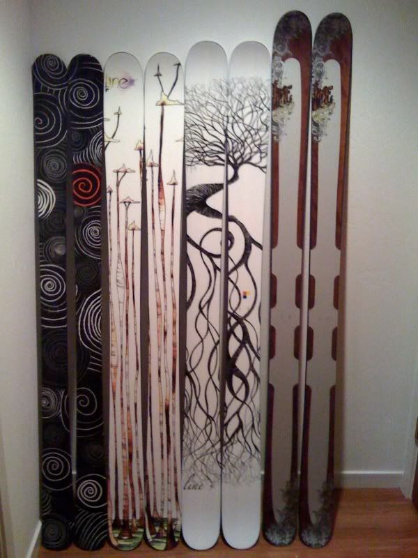
omg quad digit bump! i reached 100 posts yay. but seriously, the bent-chetlers have the sickest base graffic I have ever seen. all the classic line skis had sick graffics like 1260s, motherships (ti) with the bakini chick on them, mavericks, chronic wides, original chronics, etc.
 
haha thanks for giving me a laugh. i personally do not like boone graffics. the ones on the far right are the closest to being liked but the other two are yuck
 
i have a couple. this years invaders and chronics, last years and this years addict pro and addict, this ear and last years volkl wall, this years k2 disorderly, moment reno jibs, extreme's are pretty boss. oh and last years volkl ledge.
 
I really like to moment stuff. And all of EPs.

To the guy who keeps posting Boone stuff, don't. They have no cretivity, lack design skill, and they just look like shit skis.
 
Back
Top