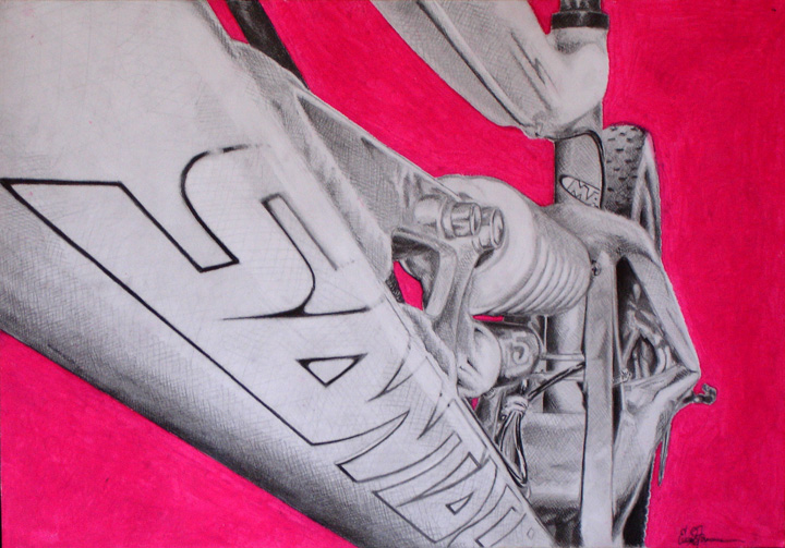
skiP.E.I. Nov 26, 2008 nice, it looks like you did it from a photo. subtle variation in the pastel tones is cool. It's so bright though, that it seems like it takes the 'oomph' away from all the detail you put into the bike and emphasizes the negative space instead.
nice, it looks like you did it from a photo. subtle variation in the pastel tones is cool. It's so bright though, that it seems like it takes the 'oomph' away from all the detail you put into the bike and emphasizes the negative space instead.