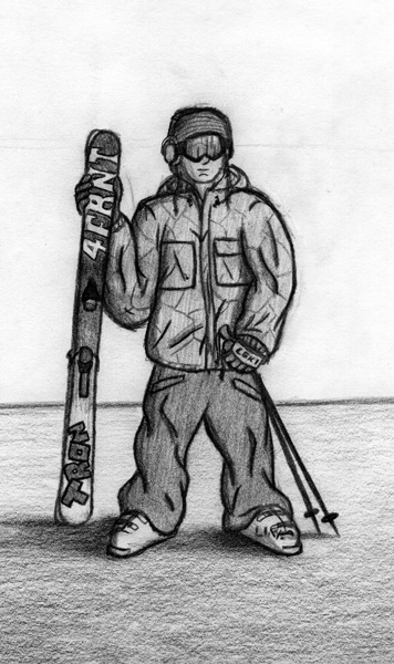
i dont mean to hurt your feelings but i have had to redo multiple art projects cause the art / creative directos didnt like one lil thing... so I mean no harm.. BUT<br />
your lines are way to thick - very your thickness of the lines dont have them be all the same<br />
--IMPORTANT it appears the skis are behind your person.... <br />
--the poles are to short<br />
---you have drawn th head for us to see part of his side but we do not see that side on the rest of the body... <br />
<br />
your shading is very good for the ground use that in side the person or for your next drawing... the person is to flat. shade like the ground and it'll be tons better...<br />
<br />
i still like it....
are you going for realistic? or cartoonish?<br />
<br />
if you're doing realistic, don't use outlines. use shading to show the edge of something. people don't have dark outlines around them.<br />
<br />
the same goes for the folds in the clothing. they look good, but gradient shading would look a lot better than dark lines.<br />
<br />
also, when you're drawing a person, you want to make sure they look like they have mass. a good way to help with this is to draw the same drawing in a lot of different ways. like one would be just to use scribbles and circles to show where there's body, without the clothes as a black, scribbled, undetailed drawing of the body, then draw it with the clothes as if the clothes were hanging on that figure inside of them. it will help it look like there's a person under the coat and pants. have the front-middle be lighter and go darker toward the sides. it'll give roundness to the skier. this applies to the face too. in your picture, you have shading on skier's right, but the whole face still has different shades to it. one shade means one distance away, so it gives a flat look. study pictures of people. it will help a lot.<br />
<br />
another thing is to try and designate a light source from a single direction. it'll help with your shading a lot. then while you're drawing the picture, think of how the light would be hitting it from that point. what would be light/lightest, and dark/darkest.<br />
<br />
lastly, make sure you have a full range from light to dark in there. from white to black. if you stick around the gray middle, it will look flat and not real. in the places where not much light will reach, make them black. and the opposite for where a lot of light is hitting. having a good range of lights and darks is one thing that'll make your picture look more real than anything. even the most accurate drawing of a person won't look right without good darks and lights in it.<br />
<br />
so yeah, if you're going for realistic, there's a couple things. if not, sorry for wasting your time.
wow, thank you so much for the comments. i like to go for the slightly realistic cartoon look. like, i dont want a mickey mouse style super outlandish cartoon, but i like the cartoon style of dark outlines and shading. <br />
<br />
i definately notice everything you guys said, and didnt notice it before. i definately think the skis do look like they are behind him, which i could easily fix by making them hit the ground by being slightly lower. and the poles... oh man, the poles they are way too short, good catch. and the head, yeah, im terrible at drawing faces, so thanks for the comment, im trying to work on them.<br />
<br />
i also think that b-wald had some good comments as well. my shading also needs a lot of work. i kind of like the simpsons style shading where there are hard lines that are mixed with darker tones of the same color as the object being shaded. but i think that with gradient shading like you said it would give a lot more depth to the person. also, i think the circles and body creating technique would help a lot. i try to do that, but im not very good at it yet, i guess i just need some practice making them look more round. <br />
<br />
thank you so much for your comments ZRO and B-Wald. i definately see everything you pointed out in there. i will work on these in my next sketch.
oh, and i forgot to add that the scanner kind of lost a little bit of my simpsons style shading that i was trying to use. you can see a little bit of what i was trying on the left side of the pants. where i used a medium tone for the whole pants, and then a dark tone next to the edge where it is shaded, and then a hard outline. but yeah, i think i need to emphasize shading a lot more to make it look more round.
I'm horrible at drawing, so this comment won't help you out as much as those, but besides the head being a bit tilted as previously mentioned, I think that it is super sick. I especially like the Line sticker on the boot and the shadows by his feet are super dope.