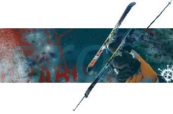
some dude posted this pic of this skier so to whomb it is..... its you... make your self known so i know who to give credits of the skier <br />
<br />
but i was learning new things in photoshop <br />
darkscaler.com - - - cool site..... ( pop out sig )
i wanted ( on bottom ) his back ski to stick out and his front ski to be hiden so it would give a dimentional illustion.. <br />
but i didnt get to it yet..
its super cool, but tis has a wierd feeling about it, not sure what ti is....liek the elft side is missing soemthign to balance the right, or the right doens't pop out enough. in either case your ona sick track!
blood splatter brushes? And smoothen out the poles man, they look jagged. Otherwise a pretty good effect for a beginner, hey we all start there at one point, just keep learned