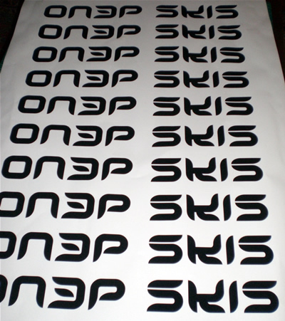
Ryan....I dig the S, do agree the K is a little bit off. But it goes with the logo as a whole, so that is how it is. I think the ON3P looks great, and I am sure eventually we will have just ON3P stickers without the skis.<br />
<br />
There are two other stickers, though. The big 3 which is pretty sick and the thirteenth and proctor spelled out, which is probably my favorite