N N Narmada06 Dec 31, 1969 ya no go...dcrew is correct simple is better, curving text and warping it is for high school students doing powere point presentations on their book report. Real design can look great with simplicityand this is a good image to do it on..
ya no go...dcrew is correct simple is better, curving text and warping it is for high school students doing powere point presentations on their book report. Real design can look great with simplicityand this is a good image to do it on..
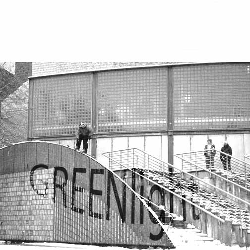
mathers Dec 31, 1969 thats gotta be a realy gay production company if they produce shit from otherwise sick photos
keepon_trucking Dec 31, 1969 the picture's cool and i agree that the text needs some work, but its a good idea