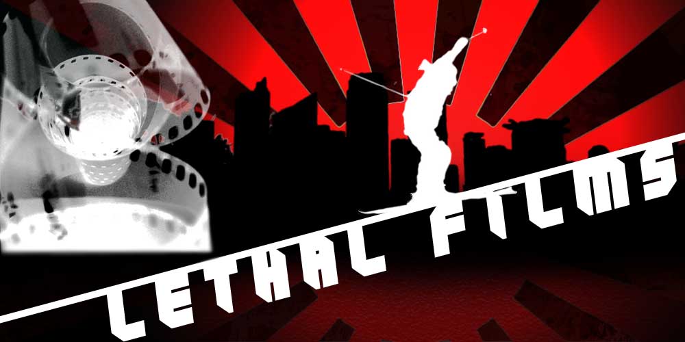
change ur font .. use a simple sans serif suttin maybe like futura, or a thick helvetica give it that clean feeling that constrasts with the brushes u use ( and i use ha) I would also try taking ur sun flares and make those a diffrent layer than the background, and make the sun flares layer a blending mode of overlay it ill blend it more so its not the focal point but it will loook sick .. its all looking great man keep up the good work.
put the film and the swirls behind the skier in. the black lines sort of stick out and need to be blended better (like Narmada06 said) and i agree with the font thing too
move the skier and the sun stripes to the middle to balance it out, you dont need to completely rework it for that. and i think the font fits the name well.