i like the guy and vector and the thought every thing is great..
BUT you wanted feed back so here I GO
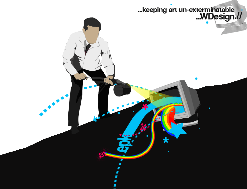
1st the first thing i noticed is the rainbows n shit to me and alot of every body rainbows=gays/fags/homo......so with you sparying pasticides on it. people may take it differently like you are gitting rid of the homos and gays or what ever in design like theres alot of gayness in design and you want to get rid of it.. not cool.. since designers have alot of homos in it id deff change that.. i am just saying it may make people think differ of your concept and more importantly of YOU. ( unless that is your concept )...
2nd the stuff is coming out of a computer and the guy is cutting the computer and bascially that computer is YOUR MAIN focull point and you are destroying that with having that other computer up in the rigt conor there is absolutly NO need or that.... unless its already an actuall logo/design that people know or you want them to know and remember so there for youd have to change your whole pic to have that logo in there... main point theres no need for that computer to be there.. its to distracting with that shitty ass boring type..
which leads me to # 3...... that TYPE your entire pic is ONE dimension.. i love the simplistity of the vector i alomost got the concept right away with out reading the type.. but with every thing being just ONE dimension you need to spice it up.. getting rid of that computer will lead to alot of space to jazzz up your type.. it could be as simple as picking a differ font or going all the way and adding some filters n such... THAT LINE is your ticket to letting people understand your thought if its to boring or just like the rest of everything they'll forget it in a few moments.. make it pop out MAKE them remember exactly what it is you want them too.
LIKE that WDESIGN that souunds like a Co. name so why is like the rest of everything when that is the MAIN thing you want people to notice is your Co name..
i believe if you get rid of that computer.. put some space between your tag line and WDESIGN it look alot better.. but PLEASE do something with the type to make it pop out... fix that and i believe it will make a world of shit better.
do not change the pic i really like that... Very simple..... the simpler the better.. the black and white are great theres already enough action coming out of the computer..
sorry if i rambled but you wanted alot of info so i gave my thoughts of what i thought.. hope they work
i understand waht your sayng but the type is kind of a style of graphic art, i like it a lot, if you've seen stuff like jibtastic it's kinda like that, and thats the main reason i dont know if i like this or not, it reminds me too much of jibtastic
i can see what you're saying though, i want to get rid of the computer in the corner, at first i though it was ok, but it looks kinda bad right now
and this has nothing to do with homosexuality, art uses many colors and i figured waht better way to express that than with a rainbow
the stuff is coming out of the computer for two reasons: #1-thats the way the stock photo i found was it was a guy pointing an exterminator thingy at a computer #2-since it's digital art and it was generated on a computer, i thought it fitting
I don't like how the image is divided in half nor the stark contrast of black and white, in the this particular case. The rainbow monitor is floating in a sea of foregroundless black and it makes my brain hurt. The overall concept is rowdy and I dig the colors.
^what ghost was saying about your type is right on. Its apparent what style you are going for, there is no misunderstanding there. Just he was telling you how you might improve upon your execution of that style.