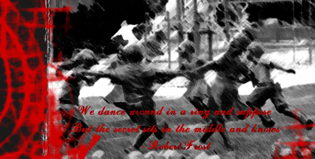
thats cool, it does need a little something, i also think the text should be moved down a little and made a little sharper or something. maybe white with an outline. not sure. but it looks really sick.
some roses, pockets full of poseys and then they all have to fall...you know like a sequence....actually its pretty sick, the main shots alittle....yah its needs something, danS' idea sounds good...
i think the red on the left kinda dominates the picture.. u might wanna chill on that... also try using a brush to put a little something hidden in the bg in bright red... like a small flower or something...it might add a cool effect... other than that i agree with danS.
Dude it looks pretty cool, i'd say for the text, make a red box and make it a bit transparent, enough so u can see the pic through it, than put the text on the box and make the text white, than move it up more and to the right, it'll make the type easier to read and it will balance the piece as a whole.