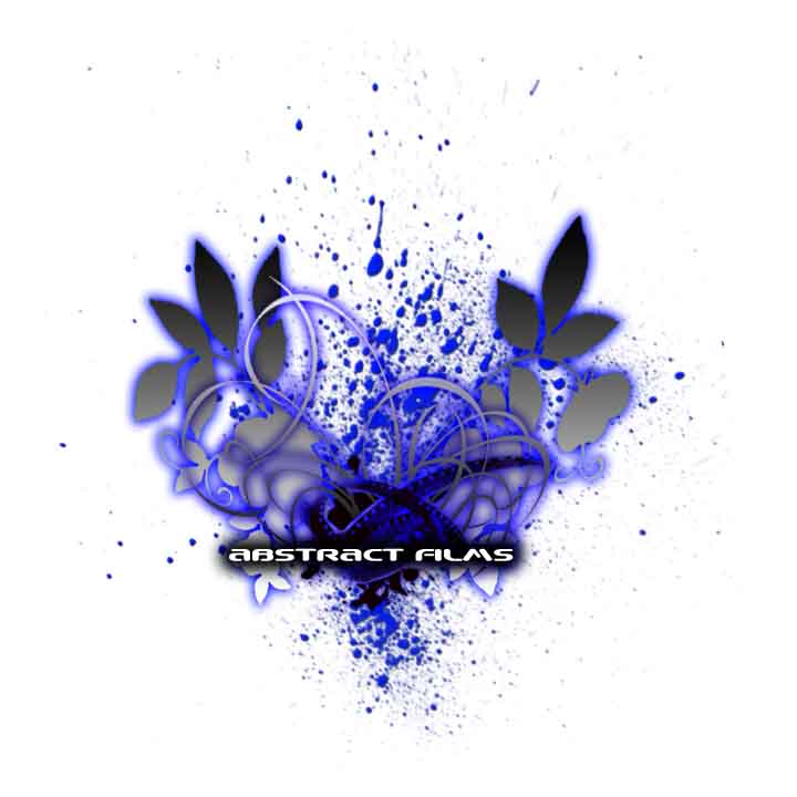
looks nice.. dont like the flowing leafs that much but there growing .. something about the glowing and the color makes me think of cars and such i dunno i could be hi-
i dont really like the splatter effect it makes it look messy... and the "ribbons" or whatever those are make it look way too busy if its going to be on a shirt.. not trying to be a dick, just trying to help... just play around with the idea a bit dont just get stuck on one image.. try expanding the idea.. think outside of the box... it will get you somethign you'd never really think of
^no. If i see one more logo with a silhouette skier on it im gonna flip shit. Its not bad now but too overdone. the simpler the better(for the most part). And brushes get real old, especially the one with the ribbons. If you go back through the last 50 pictures you'll probably see 20 of em with that same brush.
yeah i know that if it was a logo it would need to be simpler, but i forgot to say, im trying to make the front design for a shirt...thanks for all the advice, keep it coming
easy elan, settle the fuck down, these guys are just trying to make suggestions- you asked for advice<br />
<br />
take a fucking chill pill are realx the FUCK OUT
ok. I like the setup and the leaws and shit. Personaly I like it simple on shirts. But that is not bad at all. But the quality SUCKS!!! And you will never be able to get thouse brushes in print quality. The same with the neon. good luck man